


Interface Ideas for Chat Applications
Exploring new interface ideas for touchscreen chat apps.
When I message my friends, I frequently find myself thinking it would have been neat if there existed a certain feature which would have made the interface a lot more usable and fun. I started thinking about such ideas and how it would lead to an overall better experience if a chat app possessed all those. This prompted me to prototype a few of these interface ideas which ended me up in writing this document. What follows is an exploration of all these ideas I wish existed in touchscreen chat apps.

Chat Bubbles
The way apps currently visualize the state of the message you sent is with a tiny icon (usually a check mark), sometimes accompanying a piece of text. This detail is so subtle most of the time to be noticed by a novice user. As an anecdote, when my mother started using chat apps long ago, she came to me asking whether the message she sent was seen whenever she sent a message. It was hard for her to see whether the tiny tick had turned blue. She always had to put her glasses to make sure.
We chose to make this seen/unseen distinction more obvious by making the chat bubble lighter when it's seen. This provides more screen real estate to communicate the state of the message. Additionally there is a more relatable icon for the user to correlate and confirm that the chat has been seen. A tiny detail that I have additionaly included is the blinking eye. This signifies that the other party is still on our chat screen and looking at our messages. If the eye stops blinking and become static you can tell that they have left your chat window and might only reply later.
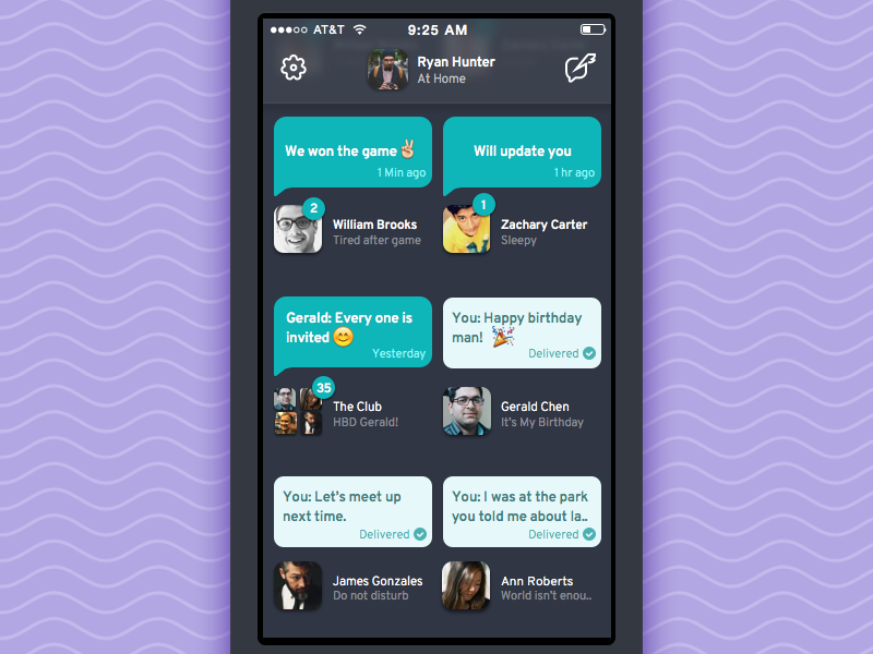

Homescreen
The homescreen of the app is imagined as a dashboard where you can view all the messages and user statuses in a quick glance.
The design of the chat bubbles are reused here so that users can easily identify the state of the messages and who sent them without much hassle. User’s live status messages are also shown on the homescreen.

Notification Reply
Occasionally, in the middle of a chat I get a message from someone that only requires a short and swift reply. Current interfaces require you to tap on the incoming message notification which takes you to a different screen from where you can send the reply. This shifting back and fourth quickly becomes tedious when there are multiple incoming messages. Moving to an whole another screen just to send a single message disrupts the flow of the ongoing conversation. We tried to minimize the cost of this context switch in our redesign.
Whenever a notification pops up there's a tiny arrow to prompt a swipe down action. On swiping, it shows all the new messages your friend has just sent. You can read through them and choose to give an instant reply without a context switch and continue back from wherever you left off.

Message Indicators
Usually when someone is about to chat with you, a pulsing indicator accompanying a text is displayed to anticipate the incoming message. We tried to make this indicator a bit more expressive by devising metaphors that were expressive of the activity being conducted at the other end.
As we can’t predetermine how long someone might take to create a message, we made the animated icons in a way that they can be looped indefinitely and can be ended at an arbitrary point in time.

Chat Likes
Most of the time in group chats there will be discussions in which people say something that need support or some kind of positive affirmation, rather than having to send a message saying I agree with this, you can just tap the like button.

Emoji Stories
Emojis in their current form are static. We have frequently noticed a tendency among our friends to chain these static emojis to tell a story. We felt that this could be made a bit more lively by turning it into an animation. This thinking lead to the idea of emoji stories: animating sequence of emojis in a flipbook-esque style.
To start animating emojis, just add a + symbol between the emojis 😊 + 😄 . You could also create multiple animations of this sort in a single message by adding a space between the sequences.

Switching Chats
Certain conversations demand frequent switching between chats. Currently, the user visit the app homescreen to switch between chats. This could become tedious when it involves a lot of switching. We attempted to simplify this roundabout process with this interaction.

Tags
Finding chats is an ardous task in chat apps. A tagging system enables the user to collect related messages together and easily access them afterwards.
To add a tag the user tap a message, type in the tags and hit add. A tag icon and the no. of tags associated with a chat is shown on the right side of the messages.

Locked Messages
There are occassions where you will have to send a private message that you don't want to share with anyone other than the receiver. This feature lets the user to lock a message which the reciever can only access after a verification check.
We chose to use TouchID here to unlock the messages. One could also use a passcode or a FaceID instead.

Timeline Jump
This is another nagging situation that pops up in chat applications often where I find myself trying to retrieve a particular message and searching turns out to be futile because recalling the exact words I sent turns out to be really difficult. Oftentimes you will have a faint memory of when this particular conversation happened, so we decided to create a timeline view that could help the user to follow this hunch and explore the chat history.
In the timeline view a bird's eye view of the whole week is presented where you can scroll horizontally to go through previous days. Images you sent and recieved are used as anchors to help you find the right spot in time to jump to.
Thank you for reading!
Support us by sharing the case study

Stay in the Loop!
Subscribe below to get notified about our next design projects
Sign up for our Design Newsletter

Hit us up!
We are taking up new projects
Tools behind the scene
Softwares used in the process of making the interface

Visual assets for the user interface was made in Sketch by Bohemian Coding.

Prototypes shown above are fully programmed in Quartz Composer by Apple.

The bouncy animations in the interfaces are powered by Origami, A Quartz Composer plugin from Facebook.

Quartz Crystal from Kineme is used to turn the prototypes from Quartz Composer into high quality videos.

